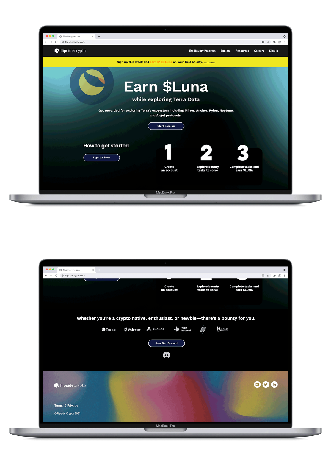
Crypto is more than just Bitcoin. It’s a data community. Flipside wants to expand this community. Explore and solve bounties and you are on your way to wealth in the digital form. You still following?
The Design Challenge
Flipside Crypto came to me looking to elevate their site and narrow in their UX. Their marketing was just starting to build and the need to for acquisition to ramp was pushing. My first task was to streamline their landing page so the user knew exactly what to do. Yes, I wanted to hold true to Crypto’s playful aesthetic but I also wanted to balance that with usability. In a world of binary grids and graphs why can’t they be both smart and pretty?
The original page where users land when they want to solve bounties for Terra Data in exchange for $Luna. My starting point.
.
Flipside’s platform was build on Editor-X. Because of this,
I became the designer and engineer having to create a fluid responsive site from drag and drop elements. The limitation became my creative challenge.


Design Elements
Extensive research went in to understanding who the user is and how they engage.
This lead me to my concept—Mystery. Flipside wants to open their doors to advanced bounties but also beginners. Possibilities are endless for everyone. I created gradients that reflected both space, future and the endlessness that both hold. The dark represents space and the light the future. The colors needed to work well with the concept and accept the bright animated graphics that represent the Crypto World. The darks set a nice backdrop to let the fun do the talking.
The audience is Gen-Z males who love crypto. They want to have it and they want to solve it. Crypto design is very amateur in style with a hint of childness. This lead me to Work Sans. I wanted something based on squares, was easy digest and common.


