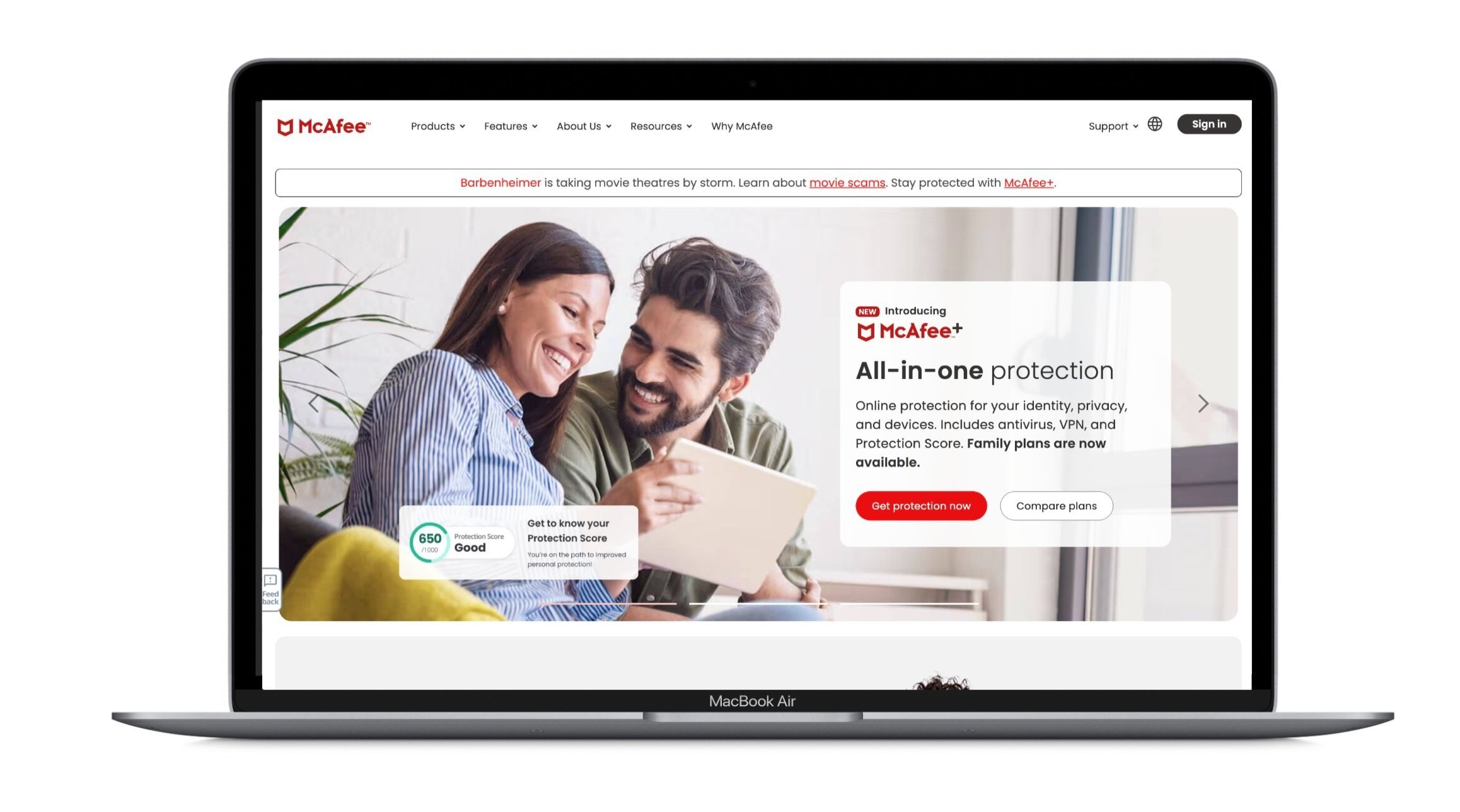
McAfee. A name that has been connected with virus and online security for decades. But did you know it is so much more than protecting your device? Neither did customers
Creative Director
What I did: Analyze and develop a fresh new look for the McAfee product offering and how it is presented to customers. In partnership with a WebDev agency, we will conduct user testing, UX/UI explorating and branding exercises to ensure top performance and elevation. Deliverables included an updated homepage, site navigation, pricing comparison, product pages, and About Us.
Key Opportunities
Urgency
Accessible on-page support, quick-start opportunities, direct help with solutions
Threat anxiety
Simple, direct copy for utmost clarity; trust builders assuring McAfee market leadership; invocations of McAfee real-time threat expertise
Family v Individual
Modules and refined plan presentment that encourages users to quickly self-select and access detailed plan pages
Clarity on features
Support/tools to help identify users’ best-fit plan; abridged listing of top features to help distinguish plans; stand-alone features module for more targeting understanding
User Testing Feedback
Price consideration is high
Interviewees generally found ways to mitigate costs or went with less expensive options.
Plan matrix is a go-to
Interviewees expected and sought out the matrix enthusiastically, spending a lot of time carefully consuming.
Let top of page do the work
Interviewees appreciated finding the most salient information right at the top of the page. Many lamented scrolling.
Wait… there’s a family plan?
The pricing plan options and features on the product level caused vast confusion among interviewees in our segments.


